Interesting, but overdone, baroque and unbalanced.
The bones were good, especially in the basement.....I was surprised.
Let's see what you think.
This is the roof of the entryway, lovely and well done, though Youngest felt like they might fall out on you. Quite dark. The Man described it as dark like a tomb. Not too far off.

An interesting detail, that seemed like it would cause problems later.

See, this is kinda what I don't like. Checked floor, striped ceiling, rectangular windows with slats and then covering all that heavy think, care I say clunky in the setting dark grey facade over it with pillars.
Meh

The chapel at the centre of the house. amazing, but BUSY

I like the biday, I like the tiles, the square tiles on the floor are fine, but all together?
Ahhhh, room to breathe, the basement that served as the garage, horses and carts down here.


For tying off the horses, a unicorn (with a horn kinda like a goat's)

and two dogs.
Looked a little like Chuck in fact.

Again, you can see Gaudí's characteristic parabolic arches, here looking LOVELY!

Newly installed, brick flooring made of wood. Who'd a thought!

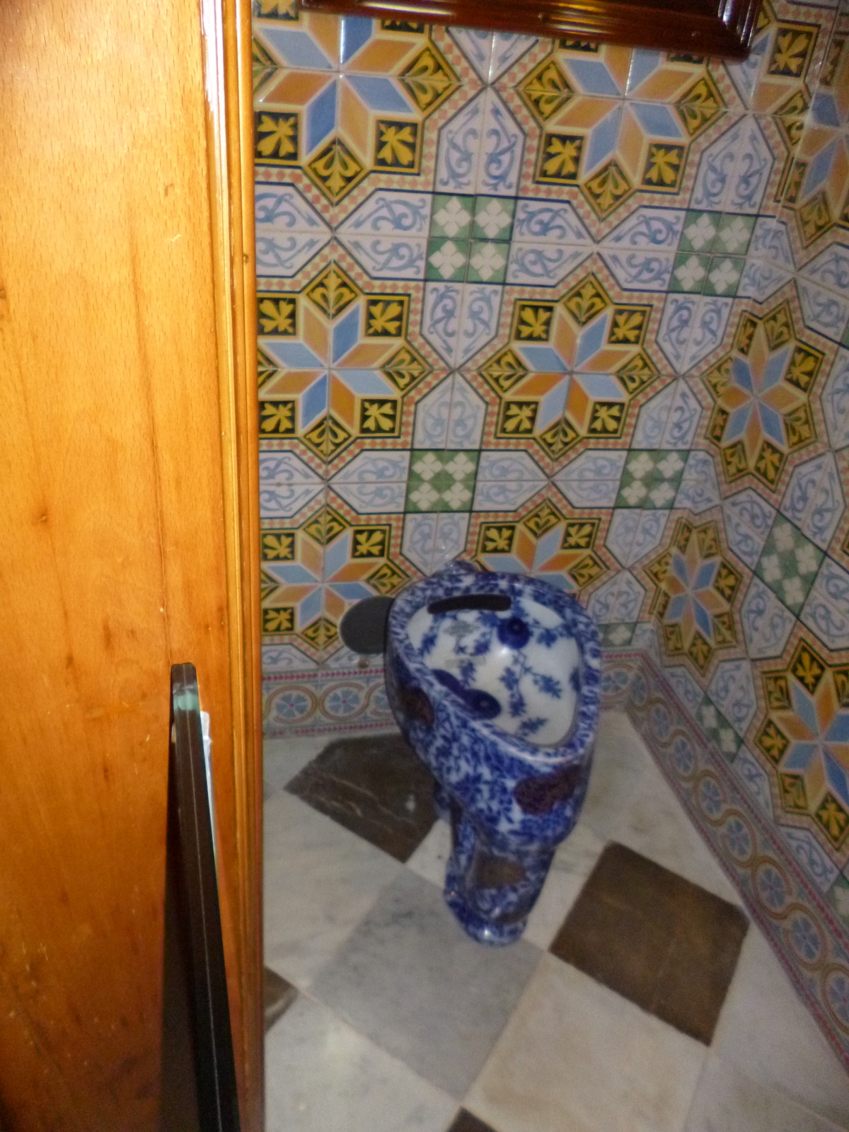
Don't know what in earth this could be for as it was in the window seat on the main floor and has two drains, but I quite like its simplicity.

Stained glass (pebbled meh) Catan flag colours, surrounded by marble and different marble and wood and a busy carpet.

Detail of the door. I am not saying that these individual elements are not amazing and lovely, just an awful lot of them all together.

This view I like, simpler, the wrought iron entrance gates with marble columns, works.

For me, this doesn't. Stained glass in many tiny picky little bits, within square frames, covered by a freestanding facade of heavy clunky dark grey marble. TOO MUCH!

Detail of the woodwork. Amazing and beautiful, but it was EVERYWHERE! Overwhelming.

This again, fussy square stained glass, etched glass drawing in the centre, freestanding heavy marble pillars, tons of carved wood, different floors and windows.

Can you say Baroque? If you click, each of those seperate points has cut glass in them so they glisten. *shudder* That's a ceiling by the way.

A little better here, looking along the passageway between the pillars and the windows along the front of the house.

Ahhhh, the attics, which were not in the original style with many small bedrooms for the staff and laundry facilities. Clean beautiful lines.

Undulating like a dragon's wing.

Out on the roof, Gaudi's characteristic chimney tops, with trencadis work to keep them interesting!


The door in the servant's stairway, that's an effective way to keep people from opening the gate from the outside, even if they have the key! There must have been concern about people coming in from the street and sneaking up!

A shadow cast by some wrought iron work supporting a banister.

Overall? Pricey, not attractive, sort of like a catalogue all laid out together, 'I'll have one of everything' style, but interesting nonetheless.
Wouldn't go back again though.
2 comments:
Looks very... unusual. Yes, kinda like they went for an "all you can eat" style architect :D. Something to see at least once, I suppose ;)
good definition, buffet style, no? Meh...... I wouldn't recommend it if you come, especially at the price, there is much more that is so much more amazing here to see and with more bang for your buck too.
Post a Comment